Your team spent six months building the perfect BI dashboard. It connects to all your systems, has beautiful visualizations, tracks every possible metric. There’s just one problem: nobody actually uses it.
Sound familiar? You’re not alone. Most companies have dashboard graveyards—expensive tools people log into once, export one report, and promptly forget. Executives still ask for “quick reports” via email. Analysts still spend hours building spreadsheets because “the dashboard doesn’t show it the way we need it.” Teams continue making decisions based on gut feel because finding the actual data takes too long.
The issue isn’t the technology. It’s that most dashboards answer questions nobody’s asking while completely missing the decisions people actually need to make every single day.
Why Most BI Dashboards Collect Digital Dust
Let me walk you through the four failure patterns we see constantly:
The “Everything Dashboard” Trap
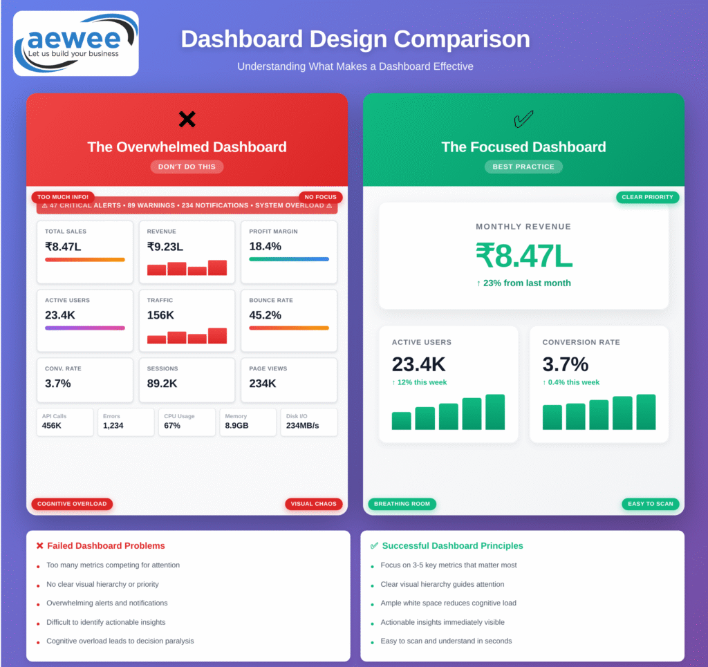
Teams try to cram every conceivable metric onto one screen. The thinking goes: if we show everything, everyone can find what they need. What actually happens? Critical insights get buried under nice-to-know vanity metrics. Your CFO has to hunt through seventeen charts to find the one number that tells her whether the quarter is on track. She stops looking.
The Analyst’s Dashboard for Non-Analysts
Technical teams build dashboards they would love to use—complex statistical charts, advanced filtering, multi-dimensional analysis. Then they hand it to a regional sales manager who just needs to know which territories are underperforming this week. He doesn’t understand half the visualizations. He goes back to his Excel spreadsheet.
The “Set It and Forget It” Approach
Someone builds a dashboard in Q1 based on what mattered then. By Q3, business priorities have shifted completely, but the dashboard still shows the same metrics. Half of them don’t matter anymore, but they’re still taking up screen space and slowing down load times. Usage drops from 40 users to 8.
No Clear Path from Data to Decision
Users can see the numbers, but they have no idea what they mean or what to do about them. There’s no context, no comparison, no indication of whether “good” looks like 73% or 95%. So they screenshot it, email it to their manager with “thoughts?”, and wait for someone else to interpret it.
The result? Less than 20% adoption, average session times under 60 seconds, and leadership questioning why they spent lakhs on BI tools that nobody touches. Meanwhile, your data team is drowning in ad-hoc reporting requests because people still can’t find what they need on their own.
What ROI-Driving Dashboards Actually Look Like
Here’s what changes when you build dashboards that people actually use:
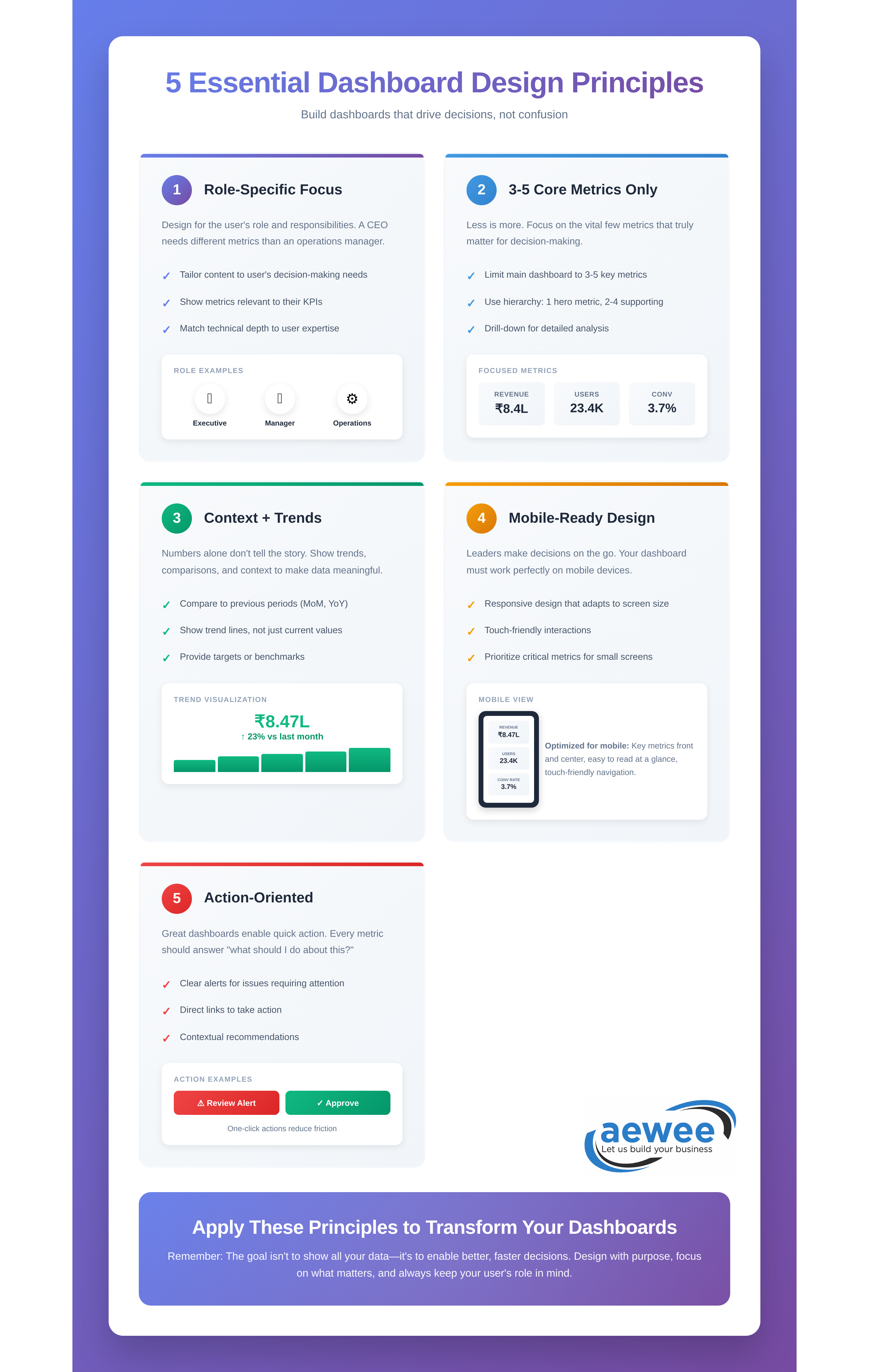
They’re Built for Specific Roles, Not Generic “Everyone”
A CFO needs completely different information than an operations manager. The CFO wants high-level financial health indicators updated daily. The operations manager needs real-time production metrics with drill-down to individual shifts. When you try to serve both audiences with one dashboard, you end up serving neither.
The dashboards that get used every single day are ruthlessly role-specific. They show exactly what this person, in this role, needs to make their most frequent decisions—nothing more, nothing less.
They Focus on the Critical Few
Research shows people typically care about three to five core metrics for their role. Everything beyond that is noise. I once watched a retail chain reduce their store manager dashboard from 23 metrics to just 4: yesterday’s sales vs target, current inventory turnover, customer satisfaction score, and staff attendance rate.
Dashboard adoption jumped from 22% to 68% in three weeks. Why? Because store managers could glance at their phone during their morning store walk, see those four numbers, and immediately know what needed attention that day.
They Provide Context, Not Just Numbers
Bad dashboards show: “Revenue: ₹45 lakh”
Good dashboards show: “Revenue: ₹45L (↑12% vs last month, 95% of target, trending to exceed quarterly goal by 8%)”
Every metric needs comparison context. Is this number good or bad? Are we trending up or down? Are we ahead or behind where we should be? Without that context, people either ignore the number or spend 20 minutes digging through historical data to figure out what it means.
They Surface Exceptions First
The best dashboards don’t make you hunt for problems. They push anomalies to the top. If your campaign cost-per-acquisition suddenly jumped 40% yesterday, that should be the first thing you see when you open the dashboard—not buried three screens deep in a trend chart.
A mid-sized SaaS company rebuilt their customer success dashboard around this principle. Instead of showing 100 customer accounts in alphabetical order, the dashboard now automatically surfaces the 8-12 accounts showing early churn signals: declining usage, unanswered support tickets, no feature adoption in 30 days. Their team started catching at-risk customers 25 days earlier on average. That translated to ₹2.8 crore in prevented annual recurring revenue loss in just one quarter.
Measuring the ROI (Because “Insights” Isn’t a Business Metric)
Let’s talk actual numbers. How do you know if your dashboard investment is paying off?
Time Savings from Eliminated Manual Reporting
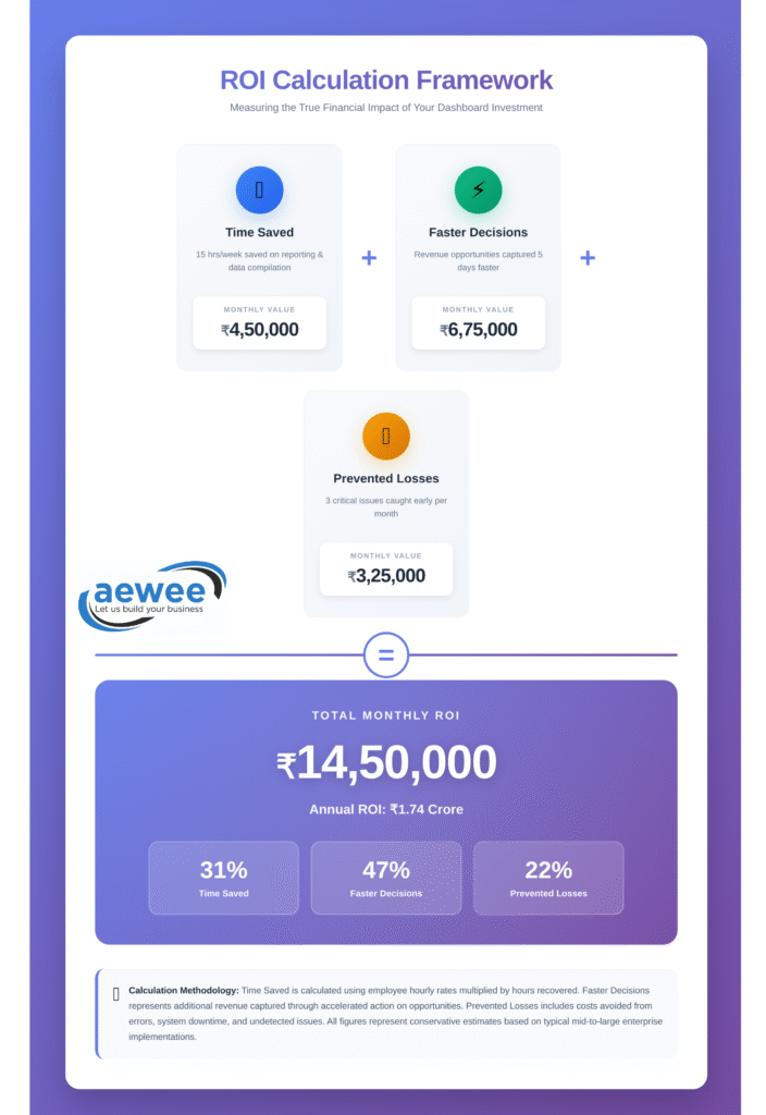
If your analysts currently spend 15 hours per week building reports manually, and your dashboard cuts that to 3 hours, you’re saving ₹3.6 lakh annually per analyst at standard market rates. If you have a team of five, that’s ₹18 lakh per year. The dashboard probably paid for itself in the first quarter.
Faster Decision Cycles
A national retail brand we worked with used to take 5-7 days to identify underperforming marketing campaigns. Their monthly media planning meetings started with analysts scrambling to pull performance data from the previous week. By the time they reallocated budget, they’d already wasted another week on campaigns that weren’t working.
After implementing real-time marketing dashboards, they cut that cycle to same-day adjustments. Campaign managers check performance every morning, pause underperformers before lunch, and shift budget to winners by afternoon. That speed advantage during their Diwali campaign period alone generated an additional ₹1.2 crore in attributed revenue from the same media budget.
Prevented Bad Decisions
Real-time quality dashboards that catch production defects 4 hours faster can prevent lakhs in wasted materials and customer returns. Marketing dashboards that identify click fraud patterns within hours instead of weeks save wasted ad spend. Supply chain dashboards that flag inventory imbalances before stockouts can mean the difference between meeting demand during peak season and losing sales to competitors who had stock.
Reduced “Can You Pull This Report?” Requests
Track the number of ad-hoc data requests your team receives before and after dashboard deployment. One company saw a 67% reduction in email requests that started with “Hey, can you quickly pull…” That meant their data team stopped being a reporting factory and started actually analyzing trends, building predictive models, and driving strategic projects.
Most mid-sized companies see 4-6 month payback periods on well-designed BI dashboards. But here’s the thing: the ROI compounds over time. As teams build confidence in the data and discover new use cases, the value keeps growing. Year two ROI is typically 3-4x higher than year one.
What Works in the Real World (Industry by Industry)
Let me show you what this looks like across different sectors:
E-commerce & Retail
The dashboards that matter here track sales velocity by product category, regional performance during promotions, inventory turnover rates, and customer acquisition cost by channel. The best implementations give regional managers mobile access so they can pull up performance during store visits—comparing today’s numbers against last week, last month, and same day last year, all color-coded by whether they’re hitting targets.
One national fashion retailer built a simple dashboard for their 40+ store managers showing just five metrics. Within two months, the average manager was checking it 4-5 times per day. The top-performing stores? They were checking it 8-10 times daily, using real-time data to make micro-adjustments to staffing, promotions, and inventory displays throughout the day.
Manufacturing
Production dashboards tracking Overall Equipment Effectiveness (OEE)—uptime, quality rates, bottleneck identification—make the biggest impact here. But here’s what matters: plant managers don’t want complex statistical charts. They want stoplight indicators. Green means the line is running smoothly. Yellow means efficiency is dropping. Red means immediate attention needed.
SaaS & Technology
Customer health scores combining usage patterns, feature adoption, support ticket trends, and payment history. The companies doing this well have automated alerts: when an account crosses into “at-risk” territory, the customer success manager gets a notification that morning with specific talking points for their next check-in call. They’re not reacting to churned customers anymore. They’re preventing churn 30-60 days before it happens.
Financial Services
Cash flow forecasting, accounts receivable aging, client profitability analysis. One accounting firm cut their month-end close process from 9 days to 3 days by building dashboards that update automatically as transactions flow through their systems. Their partners now see preliminary month-end numbers on day one instead of waiting until day seven for the full close.
Marketing & Agencies
Multi-channel campaign dashboards showing ROI by platform, conversion rates, cost per acquisition, attribution across touchpoints. The agencies winning new business are the ones showing clients these dashboards in real-time during review meetings instead of presenting static PowerPoint slides from last week’s data.
The pattern across all of these? Identify the 3-5 metrics that drive the most important decisions, provide real-time visibility, add comparison context, and make the required action obvious.
The Features That Separate “Used Daily” From “Opened Once”
After building dashboards for dozens of companies, here’s what actually matters:
Executive dashboards need:
- Four to six strategic KPIs maximum (revenue growth, profitability, customer satisfaction, operational efficiency)
- Current value plus trend direction plus comparison to target for each metric
- One-click drill-down to understand the “why” behind any number
- Updated at minimum daily, ideally real-time for critical metrics
- Mobile-optimized because executives check these between meetings, during commutes, on weekends
Operational dashboards need:
- Exception-based alerts that surface what needs attention RIGHT NOW
- Performance grids with conditional formatting showing outliers in red
- 12-week trend analysis for pattern recognition (seasonal effects, cyclical patterns)
- Drill-through capability to investigate issues without opening five other reports
- Refresh frequency matching decision frequency (if decisions happen hourly, data should update hourly)
What to ruthlessly eliminate:
- Vanity metrics with no decision value (total page views when you should care about conversion rate)
- Overly complex statistical visualizations for non-technical audiences
- Metrics that haven’t been reviewed or discussed in 6+ months
- Anything requiring a training manual to interpret
The five-second rule is real: if someone can’t extract value from your dashboard within five seconds of looking at it, you’ve already lost them. Simplify until the most important insight is impossible to miss.
From Data to Decision: Building the Action Loop
Dashboards aren’t the endpoint. They’re the trigger for a continuous optimization cycle that looks like this:
See → Dashboard surfaces an exception (West region sales trending 18% below forecast)
Understand → Drill-down reveals root cause (two top-performing reps on extended leave, new product launch delayed by supply issues)
Decide → Reallocate resources from over-performing territories, adjust targets, or fast-track product launch
Act → Execute the decision with relevant teams
Measure → Dashboard tracks impact over the next 2-4 weeks
This loop happens daily in organizations with strong BI cultures. Sometimes it happens hourly. The dashboard isn’t just reporting what happened. It’s the central nervous system enabling continuous adjustment and improvement.
A national logistics company reduced their regional managers’ weekly reporting time from 3.5 hours to 18 minutes by implementing exception-based dashboards. What did they do with those freed-up hours? Started coaching underperforming drivers and replicating best practices from top performers across regions. Their on-time delivery rate improved 7 percentage points in five months—not because they bought better technology, but because managers finally had time to actually manage instead of building reports.
That’s the real ROI. Not just seeing data faster, but having the time and clarity to act on it.
Common Pitfalls That Kill Dashboard Projects
Let me save you some pain by sharing what derails most implementations:
Starting with Technology Instead of Questions
Teams pick Power BI or Tableau or Looker, then figure out what to build with it. This is backwards. Start with “What decisions do we need to make faster or better?” Then choose technology that supports those specific decisions. The tool matters way less than you think. A focused Excel dashboard that people use daily beats an unused enterprise BI platform every single time.
Measuring Everything Instead of What Matters
I once saw a company dashboard with 47 different metrics. When I asked which ones actually influenced their quarterly planning, they could name six. The other 41? “We track them just in case someone asks.” That’s how you build dashboards nobody uses.
More metrics doesn’t mean better insights. It means more noise obscuring the signal.
No Clear Owner
Dashboards drift without someone responsible for keeping metrics relevant, data accurate, and users engaged. Assign ownership by department or role. Someone needs to wake up thinking “Is this dashboard still serving its purpose?” If nobody owns it, it slowly becomes obsolete.
Ignoring Data Quality
Beautiful visualizations of bad data create expensive misinformation. If your team doesn’t trust the numbers, they won’t make decisions based on them—no matter how pretty the charts look. Address data quality, consistency, and governance before you scale dashboards across the organization. One wrong number that contradicts what someone knows to be true destroys credibility for months.
Skipping Training and Change Management
Tools don’t drive adoption. People do. You need champions in each department celebrating early wins and showing colleagues how the dashboard helped them make a better decision. You need training sessions focused on “here’s how this helps YOU” not “here’s every feature.” You need executives visibly using the dashboards in meetings so teams know this matters.
The companies that succeed start small. One focused dashboard for one high-value use case. Build credibility with that success, then expand to other areas. The companies that fail try to boil the ocean on day one.
How AEWEE Approaches Dashboard Development
We’ve seen both extremes: dashboards that transform how companies operate, and expensive failed implementations that become cautionary tales. The difference is never technical capability. It’s understanding how actual humans make actual decisions.
Our process starts with questions, not technology:
- What decisions keep your leadership team up at night?
- Where do your teams waste the most time hunting for information?
- Which metrics, if visible in real-time, would genuinely change how you operate?
We map those answers to specific roles and specific workflows. Only then do we start talking about tools, data sources, and visualizations.
A typical engagement focuses on:
Discovery and decision mapping – Identifying the 3-5 metrics per role that create the most value. We interview the people who’ll actually use these dashboards, watch them work for a day, understand their pain points.
Data infrastructure assessment – Making sure you have clean, reliable sources feeding the dashboards. We’ve seen too many beautiful dashboards built on garbage data. They fail within weeks when users spot inconsistencies.
Iterative dashboard development – We launch focused MVPs, gather usage data and feedback, then refine based on how people actually interact with it. Not how we think they should interact with it. How they actually do.
Adoption and enablement – Building internal champions who drive dashboard usage across teams. Creating quick-reference guides focused on “how this helps you” scenarios. Training sessions where people walk through real decisions using real dashboards, not abstract features.
Measurement and optimization – Tracking ROI through time savings, faster decision cycles, and measurable business impact. If adoption drops, we investigate why and fix it. Dashboards are living tools, not one-time deliverables.
Whether you need executive dashboards for board reporting, operational dashboards for daily management, or embedded analytics within your products, the foundation stays the same: deeply understand the decisions, ruthlessly prioritize what matters, and design for actual humans who have five minutes to make a call, not fifty minutes to interpret complex visualizations.
The Bottom Line
Data doesn’t create value. Decisions do.
The best BI dashboards become invisible infrastructure. Nobody talks about them in meetings because they just work. People check them reflexively, make adjustments, and move on with their day. The insights become part of how the business operates, not a separate “analytics initiative” that requires executive sponsorship to survive.
Companies winning with data aren’t the ones with the most sophisticated tools. They’re the ones who’ve answered a simple question: “What would we do differently if we could see this metric right now instead of next Tuesday?”
That clarity is where ROI begins. The dashboard is just the tool that makes acting on that clarity fast, easy, and repeatable.
Ready to Build Dashboards Your Team Will Actually Use?
Get a free BI Dashboard Readiness Assessment from AEWEE’s analytics team.
We’ll review:
✅ Your current reporting processes and biggest pain points
✅ Key decisions that would benefit from real-time visibility
✅ Data infrastructure readiness and integration requirements
✅ ROI estimates based on your specific use cases
30-minute consultation. Zero obligation. Maximum clarity.
Book Your Free Assessment
Prefer to reach out directly?
- Email: connect@aewee.com
- Phone: +91 9409421821
- Website: aewee.com/contact-us
Let’s turn your data into decisions that actually drive your business forward.